Adobe Photoshop Elements Tutorials, Tips, and Help for Mac or PC Here is a link to Rick Patterson who has a nice Photoshop web page and is working on a webinar. He is also writing a Photoshop cheat sheet. Becky You can send him questions and he will answer. He sends out good info via e mail if you sign up. So far I have not put out ant $$$.
-
Welcome to Avian Avenue! To view our forum with less advertisments please register with us.
Memberships are free and it will just take a moment. Click here
Offering help and critiques in siggie making and art
- Thread starter Guardiavoir
- Start date
G I do not know your first name. I truly appreciate your feedback. All points well taken. I like the arrows in my Sig so will not take out. I have a huge book called The Missing Manual for p.elements. it is a good learning tool. I did not know that we can create brushes so I can do that now. I will pay more attention to grains. I almost always use enhance photo, sharpness and then reduce noise in filters. Want to work more with layer mask but not sure how that will look in a Sig. ")
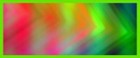
Hoping to have other sig. makers join here to learn. I was playing in Photoshop elements today which I often do. I was using the gradient and filter tools. Do you think these would make signature backgrounds or not?
Attachments
-
 41 KB Views: 13
 -
 40.2 KB Views: 10
 -
 40.2 KB Views: 9

macawpower58
Flying along the Avenue
Avenue Veteran
Celebirdy of the Month
Mayor of the Avenue
Avenue Spotlight Award
Avian Angel
Shutterbugs' Best
Dianne, that looks quite good, but no where near as nice as what you have now (I doubt you'll top that one easily).
Why not try it with the two birds (the Too and Quaker) on the signature you weren't happy with. I think that type of background (pastels and soft), might just work with them.
I really like the look of your first background photo. Not sure whether it'll ever make a good bird background, but it's too cool! Who know, it might just work for one nice bird head siggy.
macawpower58
Flying along the Avenue
Avenue Veteran
Celebirdy of the Month
Mayor of the Avenue
Avenue Spotlight Award
Avian Angel
Shutterbugs' Best
P.S. Here's your last one with Sweden as a model. I think all backgrounds are workable, you just need the right bird.
I'd stick it in your 'siggy' folder and save it. You never know when you'll want it.

I'd stick it in your 'siggy' folder and save it. You never know when you'll want it.
macawpower58
Flying along the Avenue
Avenue Veteran
Celebirdy of the Month
Mayor of the Avenue
Avenue Spotlight Award
Avian Angel
Shutterbugs' Best
Did you ever start another thread Dianne? I feel bad that we're posting all over Guardiavoir's.
It's fine to post here. This is to help others improve, and I did not intend to end up being the only one giving advice.
I like those backgrounds, but I feel like the first one is a bit flat in looks. I get it's not supposed to be the focus, but it feels like it could use something else (aside from a few birds). The third one is pretty good. I would make the border a lighter color, though. Something that is easy on the eyes.

I like those backgrounds, but I feel like the first one is a bit flat in looks. I get it's not supposed to be the focus, but it feels like it could use something else (aside from a few birds). The third one is pretty good. I would make the border a lighter color, though. Something that is easy on the eyes.
Guess I am hogging this thread. A white bird shows up well against vibrant colors. Yes I see the frame should be softer. Thanks for the praise on my current signature. It just seemed to click after I put in the background. Wish we had a blog on As where we could post so we do not take up posting room. Other forums have them. "THE ARTIST BLOG".
macawpower58
Flying along the Avenue
Avenue Veteran
Celebirdy of the Month
Mayor of the Avenue
Avenue Spotlight Award
Avian Angel
Shutterbugs' Best
Back to what this thread is about!Or maybe you want to improve on your skills! Feel free to ask for my opinion on your work so I can help you see what you might want to change. I warn you: I might be a bit brutal sometimes. I will try to be polite, though.I aim to help everyone grow their skills and improve.
Guard, I'd love a critique on my style, and ways of improving it. Getting a critique is a great way for me to see what others see, and improve areas that I'm weak in.
Do you need an example? or are you aware of the signatures that I have done?
macawpower58
Flying along the Avenue
Avenue Veteran
Celebirdy of the Month
Mayor of the Avenue
Avenue Spotlight Award
Avian Angel
Shutterbugs' Best
Bump...calling... @Guardiavoir
Sorry, I was gonna get around to this, but when I read your post asking for critique, it was pretty late at night, so I decided it would take too long writing my post and would have to leave it for later. And then the next day I was cramming in work for several hours for some contest (not sure if it can be called that) for a group on another site.Bump...calling... @Guardiavoir
(And then I forgot.
 )
)I am not sure how I can phrase this. There's a certain quality to your signatures that... um... well, I'll find the words!
 This is going to be a tough critique if I can't figure out what I'm trying to say.
Critique
Well, let me start off with this. You are very experienced in your signature making. You know your way around Photoshop pretty well, and your siggie work is among the best here on AA.
I think what I'm trying to say is that the composition of your siggies are overall pretty much the only thing that bothers me? I guess that word's close enough.
 I will use your own siggie as an example here.
I will start with the 3D text. The effect doesn't fit. I think it's how the text stretches kinda funky in the front of the hypothetical 3D space that seems off. Yes, the stretch is meant to help convey perspective, but looking at the shadows and placement of the text makes it look like the angle of the text relative to my point of view in this 3D space is not large enough to produce such an obvious perspective stretch (sound too wordy?
).So what I am visualizing is that if I were facing the text head-on, the B would be more stretched than the other letters (I sound a bit nitpicky...).
Well, moving on. The colors don't quite fit either. The pinkish-gray text is set against a gray background. It doesn't exactly pop out from the background. Maybe using a brighter color would help. In that color square in the color picker, a color from the very top edge of the square would work better IMO. A color from that range would be light enough to keep it from blending into the darker background and would also add an extra pop of color to the work.
Overall, that particular piece's colors blend in. My eyes don't pay much attention to the siggie because I don't see anything quite popping out at me.
But that was one siggie.
I looked through your more recent siggies, and what I notice the most is just like with your siggie: the colors blend in a lot. One recent piece of yours used more saturated colors, but at the same time, the subjects of the piece were also more saturated, and so they blended in.
Summary
- You have high levels of experience.
- You are among the top siggie makers on AA.
- The colors blend in.
- The perspective on your 3D effects needs some work.
I hope this helps.
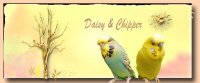
Guardiavior and Becky: I like to make backgrounds with brushes and such as you know. What do you think of this one. I discovered some brushes, like the tree, that I did not know were on Photoshop. thanks
Attachments
-
 45.8 KB Views: 11
I like this background, but I would recommend getting rid of that black rim.Guardiavior and Becky: I like to make backgrounds with brushes and such as you know. What do you think of this one. I discovered some brushes, like the tree, that I did not know were on Photoshop. thanks
macawpower58
Flying along the Avenue
Avenue Veteran
Celebirdy of the Month
Mayor of the Avenue
Avenue Spotlight Award
Avian Angel
Shutterbugs' Best
Guard.
I do see what you say about my name's perspective, and if I was doing it again I'd repair that. I never noticed it before though...it would look better the way you said!
As for not popping out, I think that's exactly what I'm trying to achieve. I dislike loud and over bright art. I love soft, muted art. I dislike busy art, and love simple classic uncluttered stuff.
Thank you for your compliments, and your suggestions. One I fully agree with, and the other is probably what makes my signatures mine. The blended colors, and subjects that melt into it, are what I'm trying for.
I think I want the whole signature looked at as one, and not as just a background for a bird. Does that make sense? I feel like what surrounds the bird is almost as important 'to me' as the bird itself.
I do warn folk though that my signatures are like you said, not 'popping' with color and/or activity. I do like some of those that others have done, I just can't for the life of me, feel the desire to create one.
I do enjoy talk about digital art. Some things will never change that I do, but I'll also gladly pick up and utilize ideas and suggestions from others.
I also like it, but have different advice about your black outline. I would like to see it as a different color, one that is a little darker than whatever color your chose from your background photo. I also would like to see it with a small fade, so that it's not as stark as it is, so it looks almost like an old photo with faded/burnt edges. For some reason, it gives me a 'vintage' feel, which I like and would expand on. I think I would also take a little of the bright out of the yellow on that background.
Now that's if I was using it.
I do see what you say about my name's perspective, and if I was doing it again I'd repair that. I never noticed it before though...it would look better the way you said!
As for not popping out, I think that's exactly what I'm trying to achieve. I dislike loud and over bright art. I love soft, muted art. I dislike busy art, and love simple classic uncluttered stuff.
Thank you for your compliments, and your suggestions. One I fully agree with, and the other is probably what makes my signatures mine. The blended colors, and subjects that melt into it, are what I'm trying for.
I think I want the whole signature looked at as one, and not as just a background for a bird. Does that make sense? I feel like what surrounds the bird is almost as important 'to me' as the bird itself.
I do warn folk though that my signatures are like you said, not 'popping' with color and/or activity. I do like some of those that others have done, I just can't for the life of me, feel the desire to create one.
I do enjoy talk about digital art. Some things will never change that I do, but I'll also gladly pick up and utilize ideas and suggestions from others.
Guardiavior and Becky: I like to make backgrounds with brushes and such as you know. What do you think of this one. I discovered some brushes, like the tree, that I did not know were on Photoshop. thanks
I also like it, but have different advice about your black outline. I would like to see it as a different color, one that is a little darker than whatever color your chose from your background photo. I also would like to see it with a small fade, so that it's not as stark as it is, so it looks almost like an old photo with faded/burnt edges. For some reason, it gives me a 'vintage' feel, which I like and would expand on. I think I would also take a little of the bright out of the yellow on that background.
Now that's if I was using it.
macawpower58
Flying along the Avenue
Avenue Veteran
Celebirdy of the Month
Mayor of the Avenue
Avenue Spotlight Award
Avian Angel
Shutterbugs' Best
Oh, Dianne. One other thing I'd do with that signature, is find a better way for the birds to sit. I hate hanging feet! I'd either lower the birds slightly so their feet are not in the sig, or find a way to make it look like they have a surface of some sort that they're on. It almost looks like they're holding the shadow, but not quite enough. I'd also 'build' the rest of the toes if you decided to keep the feet.
I'd either lower the birds slightly so their feet are not in the sig, or find a way to make it look like they have a surface of some sort that they're on. It almost looks like they're holding the shadow, but not quite enough. I'd also 'build' the rest of the toes if you decided to keep the feet. macawpower58
Flying along the Avenue
Avenue Veteran
Celebirdy of the Month
Mayor of the Avenue
Avenue Spotlight Award
Avian Angel
Shutterbugs' Best
What does Beach mean? Am I out of the loop? 
Nope, you aren't. I'm a wicked-cool cat in the groove and I haven't ever heard someone spin this slick new style before.What does Beach mean? Am I out of the loop?

I suppose it might mean like, "Thanks, man"?
macawpower58
Flying along the Avenue
Avenue Veteran
Celebirdy of the Month
Mayor of the Avenue
Avenue Spotlight Award
Avian Angel
Shutterbugs' Best
Um...OK. 
